The artwork for Joy Division's Unknown Pleasures album is based on a graph of radio waves from the first identified pulsar - this is a graph of radio waves from the same pulsar, but recorded in 2012.
Origins of the Joy Division artwork
Stephen Morris (the Joy Division drummer) found this image in the Cambridge Encyclopedia of Astronomy. It's a graph showing the regularity of the pulses of CP 1919 (PSR B1919+21) - the first radio pulsar discovered (1967).
Peter Saville took this image and inverted it for the for the cover of the Unknown Pleasures, there's more information in the video below.
This blog post gives some information about when the graph appeared.
Data
Disclaimer: I know almost nothing about pulsars
The data for the graph above comes from Pulsar Group CSIRO Astronomy and Space Science.
Recording of the first-discovered pulsar CP1919 (PSR B1919+21) made at the Parkes radio telescope in April 2012. The observing frequency was 732 MHz and bandwidth 64 MHz. The audio is the detected and dedispersed signal modulating white noise.
Credit: R. N. Manchester, G. Hobbs and J. Khoo, CSIRO Astronomy and Space Science
You can listen to it here - you're listening to a star which is pretty mental.
I took that wav file and had a look at the data with sox (I eventually pulled out numbers with canvas_waveform).
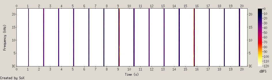
There was a lot of blank space in the data. I'm not sure if this is because of the way that I extracted it, or the way that it had been pre-processed, or maybe that equiptment has changed over the last 40 years.
When I managed to plot it, it's no-where as pretty as the original one. I've just been talking to @olorton about why this might be the case - we think it might be because I'm plotting amplitude rather than frequency, he's going to have a hack tonight to see if he can get something better. If you have any ideas, please do give me a shout.
Visualisation
Looking at the original plot, I thought that the peaks obscuring the preceeding ones above meant a loss of information. Though when I plotted it with a transparency it became a lot harder to read - you don't know whether lines were going up or down and it looks a bit messy too. Though I could see that some lines were totally flat, which is cool and I don't know why.
Another thing that I realised when I came to plot the graph was that there is a period of silence between each of the peaks (the pulsar has a period of 1.33730s and a 0.04s pulse width) - I've added a toggle so that you can see pluses along with the silence.
Both of these points are good cases for the original visualisation which is to show how periodic the pulsar is (I think).
Also, this shows 80 cycles of the pulsar - so it covers about 1m47s (I was slightly sad that none of the songs on the album are this length).
Other things
If you liked listening to the stars, check out this list of unexplained sounds on Wikipedia, they are mostly things in the sea and pretty awesome. I like how the 52-hertz whale is described as being "just higher than the lowest note on a tuba".